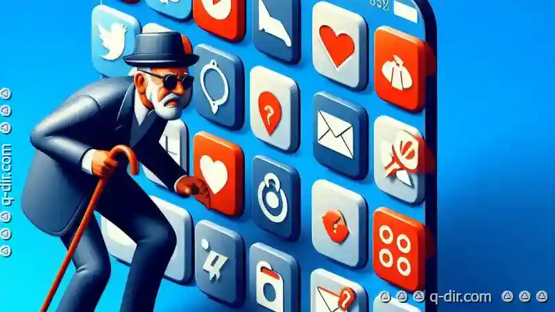
One fundamental aspect that shapes these interfaces is the way we present information-and perhaps nowhere is this more evident than in iconography. Icons ...
 have become a ubiquitous element across various platforms and devices, serving as visual symbols to represent complex ideas or actions with simplicity and clarity. However, how do we ensure that our approach to icons remains both effective and engaging? In this blog post, we'll explore the current state of icon views on different platforms and consider if there is room for improvement through a more thoughtful approach to design defaults. In today's digital age, user interfaces are the backbone of interaction between users and technology.
1. Understanding Icon Views: What They Are and Why They Matter
2. The State of Icon Views Today
3. Designing for Engagement and Efficiency
4. Conclusion: Embracing Change Without Disrupting Comfort
1.) Understanding Icon Views: What They Are and Why They Matter
Definition and Functionality
Icons are visual symbols that represent ideas or actions. In UI/UX design, they serve as graphical representations of functionalities, concepts, or entities within an application. Icons help users quickly understand the purpose behind a button, menu item, or feature without requiring extensive text explanations. For example, a musical note might represent playing music in an app, and a heart could signify favoriting content.
Importance in Interface Design
In interface design, icons play several crucial roles:
- Communication: They convey information at a glance.
- User Recognition: Icons help users recognize features quickly due to their universal language across different platforms and devices.
- Brand Consistency: Icons can reinforce brand identity if designed thoughtfully.
2.) The State of Icon Views Today
While icons are undeniably useful, there's often a tendency to stick with what’s familiar rather than exploring more innovative or effective ways to present them. Let's take a look at some common practices and potential improvements in this area.
Common Practices
- Standard Icons: Many applications use standard icons that conform to general design trends, such as iOS or Android default icons. These are usually simple geometric shapes with easily recognizable symbols.
- Color Usage: Color is often used to differentiate between different types of icons (e.g., primary actions in blue, secondary in gray). However, overuse of certain colors can lead to visual clutter and confusion.
- Size and Scale: Icon sizes are generally fixed or vary linearly based on the interface density. A more nuanced approach could involve adaptive sizing depending on context or usage frequency.
Potential Areas for Improvement
While current icon views serve their purpose effectively, there’s room for innovation:
- Adaptive Icons: Devices like Android 10 introduced dynamic icons that adapt to different contexts and sizes (e.g., in the launcher, minimized view, or full screen). This approach could be extended to other platforms and devices.
- Contextual Icons: Icons that change based on context (e.g., a document icon might turn red if it has unsaved changes), providing visual feedback about state without cluttering the interface.
- Interactive Icons: Icons that can respond to user interaction, such as expanding or changing color when hovered over, could enhance engagement and clarity.
3.) Designing for Engagement and Efficiency
When designing icon views, the goal should be to optimize both aesthetics and usability. Here are some strategies to consider:
Balancing Aesthetic and Usability
- Consistency without Boredom: Icons need to remain recognizable yet feel fresh and engaging. This can be achieved by introducing subtle variations in style or using unexpected but appropriate symbols.
- Color Psychology: Understanding the emotional impact of color on user behavior can lead to more effective icon design. For example, using warm colors for inviting actions like 'Add' and cool colors for organizing features like 'Folder'.
Leveraging Technology and User Data
- Adaptive Icons Based on Usage: By analyzing how users interact with icons over time-for instance, which ones are clicked most frequently-designers can tailor the icon appearance to better serve those needs.
- Personalization: Allowing users to personalize their icon views according to preferences or themes could greatly enhance user engagement and satisfaction.
4.) Conclusion: Embracing Change Without Disrupting Comfort
The default settings for icons in various applications are often sufficient but also ripe for improvement. By embracing adaptive, interactive, and context-aware design principles, we can create more engaging interfaces that serve users better without disrupting their established workflows or expectations. This shift not only enhances the user experience but also keeps interface design vibrant and responsive to technological advancements.
In conclusion, while current icon views are functional and widely used, there is a clear opportunity for enhancement in terms of aesthetics, interactivity, and personalization. By doing so, we can ensure that our interfaces remain both engaging and efficient, adapting gracefully as technology advances and user behaviors evolve over time.
The Autor: / 0 2025-06-13
Read also!
Page-
The Nostalgia of Classic Tree View Interfaces
One such interface element is the classic tree view, a staple in many desktop applications for its ability to represent hierarchical data in an ...read more

Beyond the File System: Copying Ideas in a Connected World.
While traditional file management tools have served us well, there are new frontiers to explore when it comes to organizing and moving files ...read more

Why Your Files Are Slowly Becoming Unreadable
However, many users encounter issues where their files become unreadable over time. This blog post will explore the basic concepts of file management ...read more
