From personal laptops to enterprise servers, these tools are indispensable for managing files and navigating through directories. However, a common issue ...
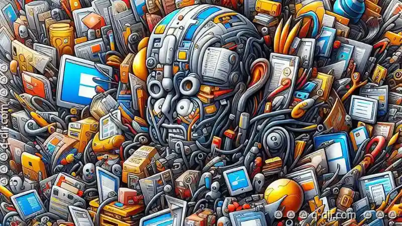
 that many users encounter is the cluttered user interface (UI) in file explorer applications. This blog post will delve into why cluttered UIs can be detrimental to both usability and efficiency, drawing examples from popular platforms like Windows File Explorer and macOS Finder. In today's digital age, file explorers serve as our gateways to vast repositories of information stored within computers.
1. Cognitive Overload
2. Difficulty in Locating Functionality
3. Reduced Focus on Main Tasks
4. Inefficient Use of Space
5. Inconsistent Information Architecture
6. Lack of Customization Options
7. Impact on User Experience (UX) and Satisfaction
8. Influence on Perception of the Brand or Product
9. Conclusion: The Case for Clean Design
1.) Cognitive Overload
Cluttered interfaces overwhelm the cognitive processes of users, leading to increased mental effort required to perform basic tasks. When a user interface is packed with too many elements-buttons, icons, text labels, etc.-the brain has to process more visual information simultaneously. This can cause confusion and lead to errors in operations like navigating through files or executing commands.
2.) Difficulty in Locating Functionality
One of the primary issues with cluttered UIs is that they make it harder for users to locate specific functionalities. For instance, consider a user trying to find advanced settings or hidden options within a file explorer. If these are buried among numerous icons and shortcuts, even experienced users might struggle, let alone beginners who may not be aware of all the potential features available.
3.) Reduced Focus on Main Tasks
The abundance of visual elements in cluttered interfaces can distract users from their main tasks. Instead of focusing on what they need to do (like copying or deleting files), users are often pulled into exploring and understanding the interface itself, thus wasting time and energy that could have been better utilized.
4.) Inefficient Use of Space
While some might argue that cluttered UIs provide more information at a glance, in reality, they can be inefficient as well. The complexity introduced by too many elements often leads to wasted space due to overlapping content or unnecessary icons and labels. This not only makes the interface visually unappealing but also less effective in managing files efficiently.
5.) Inconsistent Information Architecture
A cluttered UI is more prone to inconsistent information architecture, where different sections of the UI use various layouts and organizational methods for similar types of content (like folders or search results). This inconsistency can lead to confusion as users struggle to understand how certain elements are related or grouped within the interface.
6.) Lack of Customization Options
Most cluttered file explorer interfaces lack customization options, forcing users into a one-size-fits-all approach. Users who prefer a more minimalistic setup or those with specific organizational needs find it challenging to adapt their environment to suit these preferences because there are no intuitive ways to customize the interface to meet individual requirements.
7.) Impact on User Experience (UX) and Satisfaction
The negative effects of cluttered UIs extend beyond mere usability; they can significantly impact user experience (UX) and satisfaction. Poor UX leads to frustration, which in turn reduces user satisfaction. This is particularly problematic for software that is expected to be both efficient and easy-to-use, like file explorers.
8.) Influence on Perception of the Brand or Product
A cluttered UI can influence how users perceive the brand or product associated with the file explorer. Poorly designed interfaces often give off a sense of disorganization or neglect from the company developing it. This perception can affect future trust and credibility in other products developed by the same company, influencing their overall market image negatively.
9.) Conclusion: The Case for Clean Design
In contrast to cluttered UIs, clean designs focus on simplicity and efficiency. They make efficient use of space, provide clear visual hierarchies, and allow users to accomplish tasks without undue mental strain or distraction. This approach not only enhances user satisfaction but also boosts productivity by facilitating a more seamless interaction with the software.
As technology continues to evolve, it's crucial for developers and designers to prioritize simplicity over complexity in UI design. By doing so, they can create intuitive interfaces that are both functional and aesthetically pleasing, thereby enhancing overall user experience and potentially boosting product appeal.

The Autor: / 0 2025-04-27
Read also!
Page-

The Secret Power of Pinned Tabs in File Managers
They are more than just directories and folders; they are command centers where we store, access, and manipulate vast amounts of information. Among ...read more

Why "Move" Should Be Used with Strategic Intent.
Whether you're organizing files from one directory to another or restructuring your entire project, understanding how and when to strategically ...read more
How Icon View Makes File Comparisons Impossible
When it comes to managing and comparing files, different views offer unique perspectives and functionalities. Among the various options available in ...read more